Blog
Analysis and insights on housing markets and economic trends

How to Check the Crime Rate in an Area Before You Move
The FBI's 2025 numbers show a record national drop in violent crime. Here is how to check the one place you are moving to, in five steps with free data.

What Happens to a Boom Town When the Boom Ends?
Bodie vanished, Houston reinvented itself, Williston kept its people. What decided each ending, and three questions to ask before buying in a hot county.

What to Look For When Moving to a New City: 5 Predictive Signals
The signals most relocation lists check measure where a place is today. These 5 tell you where it's going — and they're each checkable for any county.

Affordable Places to Live With Good Air Quality (2026)
Americans are leaving bad-air counties to cut costs, not chase clean skies. Here are the U.S. counties where good air and affordable homes actually overlap.

Why the 'Safest County in America' Keeps Changing
Ask which U.S. county is safest and the answer keeps changing — because in a small county one homicide swings the rate. Here's the statistics underneath it.

Why America's Safest Counties Cluster in the North
Of the 50 safest large U.S. counties, 41 sit in the Northeast or Midwest. The reason isn't the weather — it's county lines, wealth, and how deaths get counted.

Which States Are Losing Population — and Why Home Prices There Rarely Fall
A quarter of the U.S. counties we track are losing residents. In 86% of them, home prices are still rising. Here's why fewer people rarely means cheaper homes.

What Makes a Boom Town? Only 23 U.S. Counties Qualify
We ran 1,001 U.S. counties through a three-engine test — jobs, wages, and people all rising fast. Just 23 pass. And 10 of them are middling home-price bets.

The Cheapest States to Buy a Home Just Got an Insurance Tax
The states topping every "cheapest place to buy" list are where home insurance is rising fastest. Fold it in and the affordability edge nearly vanishes.

Are Home Prices Going Down? Your Paycheck Is Finally Winning
Wages outran home prices in 70% of U.S. counties last year. The biggest relief hit the Sun Belt boom towns that priced people out — with one catch.

The Movers Are Outrunning the Jobs: 29 of America's 30 Fastest-Growing Counties
In 29 of America's 30 fastest-growing counties, people are arriving faster than jobs. We dug into the BLS and Census data to explain why — and what it means before you move.
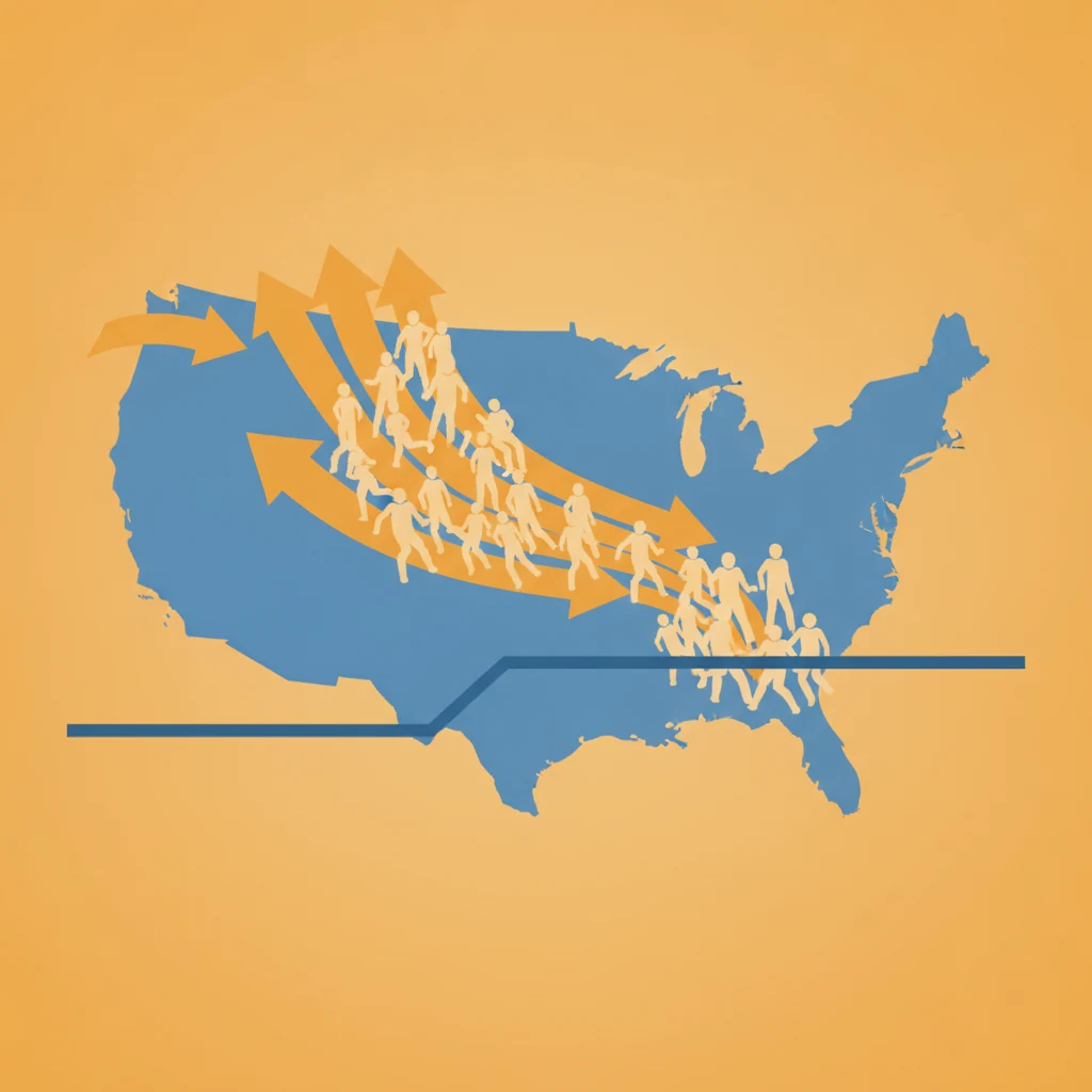
America's Population Growth Just Halved — and the Places Absorbing the Movers Rank Worst for Home Prices
New Census data shows U.S. population growth cut in half — and the Southern counties absorbing the domestic exodus are the ones our model ranks worst for home-price growth.
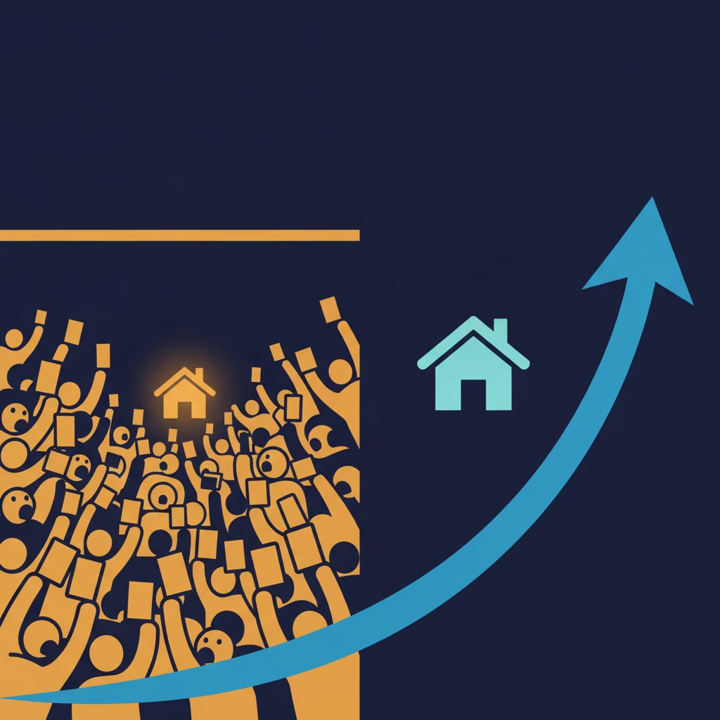
Bidding Wars Don't Predict Home-Price Growth
America's fiercest bidding wars and the counties our model forecasts to appreciate most barely overlap. Market heat measures scarcity, not future growth.

The Data Center Boom Is Reshaping Which Towns Grow
A hyperscale data center can turn a farm county into a boomtown overnight — but for the people who already live there, the boom is complicated.

How to Read a Boom Town Score Before You Move
A high Boom Town Index score is a home-price forecast, not a verdict on quality of life. Here's how to separate momentum from level before you relocate.

Best Places to Retire Have the Weakest Home-Price Forecasts
America's favorite places to retire — Florida, Arizona, Nevada — are where our model forecasts the weakest home-price growth. The trade-off, by the data.

Crime Reports vs. Death Records: Why 'Safest' Lists Disagree
Most 'safest county' lists count police crime reports. We count death records. Here's why the two disagree — and what each number can and can't tell you.

The Migration Mirage: America's Top In-Migration Counties Are College Towns That Barely Grow
America's highest in-migration counties are mostly college towns where students churn in and out. Why raw 'newcomer' rankings mislead relocators — and what to read instead.

America's Best-Weather Counties Have the Weakest Home-Price Forecasts
America's best-weather counties post the lowest 5-year home-price growth forecasts. The climate-vs-appreciation trade-off — and the 11 places that beat it.
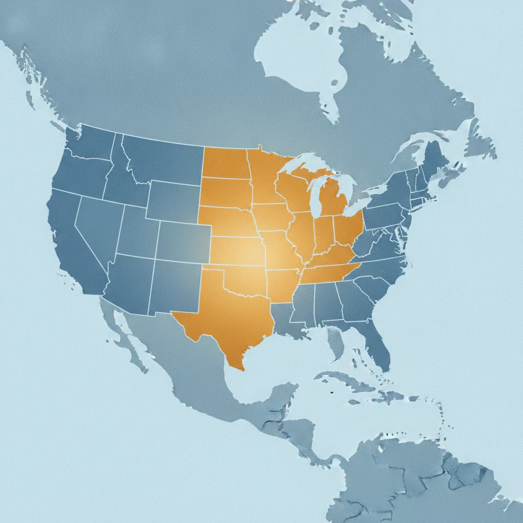
America's Next Boom Towns Aren't Where You Think: We Ranked 9 Housing-Market Types
We sorted every U.S. county into 9 housing-market types, ranked by the model's forward price prediction — and the fast-growing Sun Belt lands near the bottom.
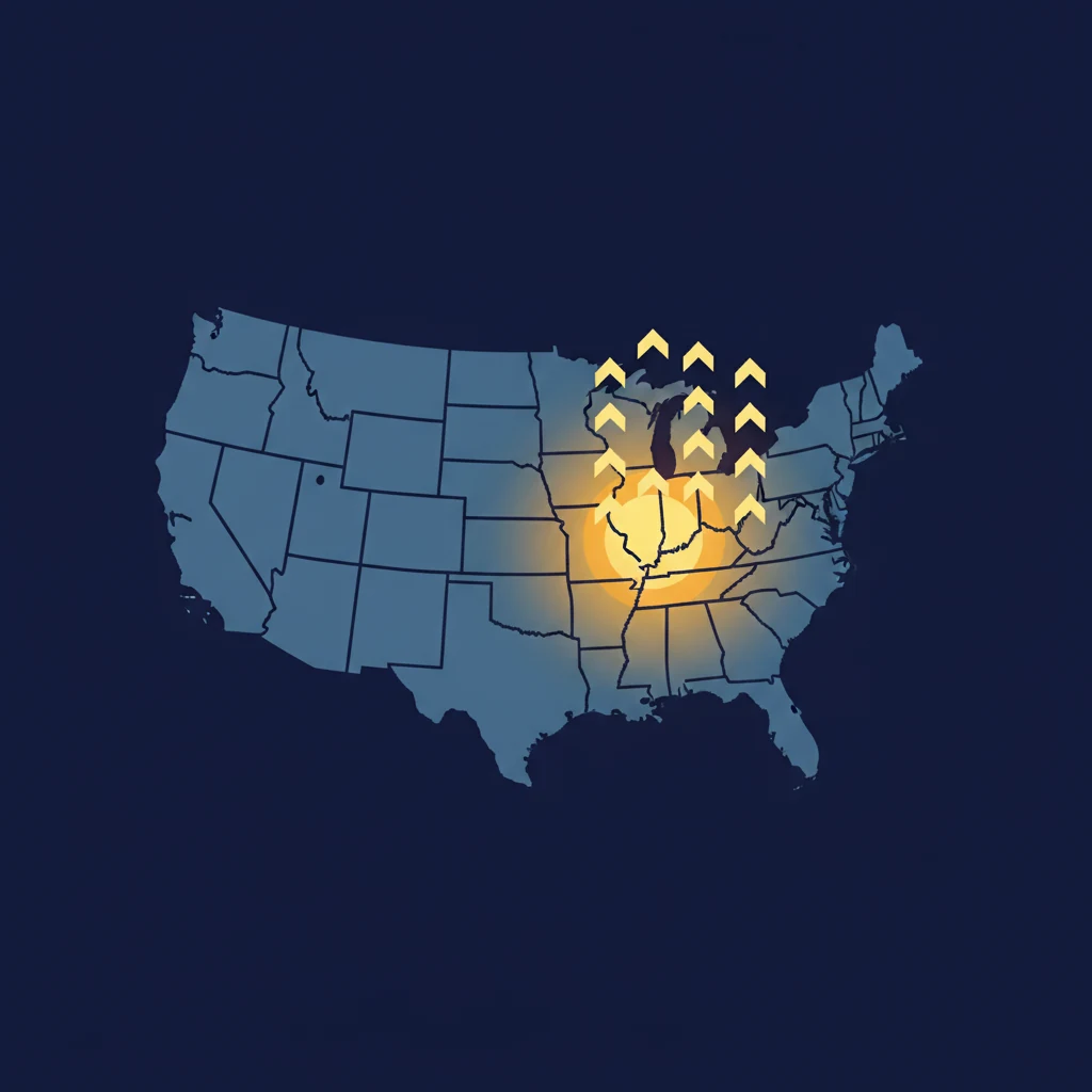
The Safest, Most Affordable Places to Live Aren't Boom Towns
We filtered U.S. counties for safe, affordable, and a strong 5-year home-price forecast. The winners aren't Sun Belt boom towns — they're in the heartland.

When a 30% Pay Cut Still Leaves You Richer: The Cost-of-Living Arbitrage Math
Most salary-cut decisions are evaluated wrong. The math is dominated by housing — and a 30% pay cut often nets more cash than the original job.

The Builders Already Picked Their Next Boom Towns (And They're Not in Austin Anymore)
Single-family permits crashed 50% in Austin, Nashville, and Tampa from 2019 to 2024 — while doubling in counties most relocators have never heard of. Where builders put capital tells you what they think demand will support.

5 Signs a "Fastest-Growing" County Has Already Peaked
Most fastest-growing-county lists are 2-3 years stale. Five data signals — building permits, job-mix, wage-vs-price, migration trend, amenity backing — tell you in five minutes whether a hot county has already crested.

$4 Trillion in Capital Investment: We Mapped 3,901 Projects Across 858 U.S. Counties
We tracked $4T in announced capital investment across 858 American counties. Data centers ($2T), energy ($890B), manufacturing ($590B). Here's where the money is flowing in 2026 — and the rural counties getting more capex than New York City.

The Boom Town Safety Paradox: Why Top-Ranked Counties Skew Unsafe
Of the 50 highest-scoring counties on the Boom Town Index, 48% grade C, D, or F on safety. The data reveals an uncomfortable pattern about where economic value hides.

Housing P/E Ratio: How to Value Real Estate Like a Stock
The housing P/E ratio compares home prices to local economic output. Learn how this metric reveals overvalued and undervalued real estate markets across the U.S.