Why America's Safest Counties Cluster in the North
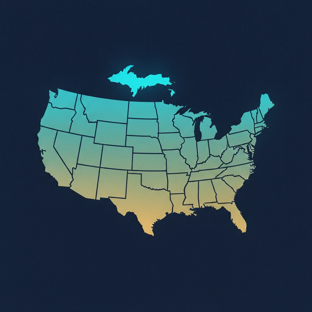
Rank America's large counties by homicide rate and a strange map appears. Of the 50 safest counties with more than 100,000 people, 41 sit in the Northeast or the Midwest. Just four are in the South and five in the West — the exact regions absorbing most of the country's movers. The list reads like a tour of established Northern suburbs: Morris County, New Jersey and Saratoga County, New York tie for the lowest rate in the nation at 0.7 homicides per 100,000. Rockingham County, New Hampshire, Kent County, Rhode Island, and McHenry County, Illinois are all close behind.
It is tempting to conclude that the North is simply safer. It isn't that clean. The map is really measuring three things at once — wealth, the way states draw their county lines, and which places have enough deaths to be counted at all — and none of them is latitude.
The tilt is real, not a rounding quirk
Start with the honest version of the statistic. The Northeast and Midwest together make up about 40% of the 601 large counties with a usable homicide rate — but they account for 82% of the 50 safest. The South is the mirror image: 42% of large counties, and only 8% of the safest. That gap is too big to be noise. Something is genuinely pulling the safest places north. The question is what.
Mechanic one: safety tracks wealth
The safest large counties are rich. Their median home value is about $402,000 against $309,000 for large counties overall, and their median household income runs near $103,000 versus $79,000. Low homicide rates travel with affluence, established housing, and low concentrated poverty far more reliably than they travel with any compass direction. The Northern suburbs at the top of the list — Morris, Saratoga, Rockingham — are exactly the kind of high-cost, long-settled places where the conditions that correlate with violence are largely priced out. Read the ranking as a wealth map and most of it stops being mysterious.
Mechanic two: it's how states draw county lines
This is the part almost every "safest county" list gets quietly wrong. Northeastern and Midwestern states carve themselves into many small counties, so an affluent suburb like Morris County, New Jersey or Delaware County, Ohio gets to be its own county — its low rate stands alone, cleanly separated from the nearest city.
The South and West do the opposite. They draw enormous counties that swallow a metro whole. Phoenix's safest suburbs sit inside Maricopa County, which grades a middling C at 6.6 per 100,000 because the same boundary also contains the urban core. Houston's Harris County lands at a D. Las Vegas's Clark County, Los Angeles County, and Miami-Dade all grade C or D for the same reason: one county line averages the safe neighborhoods and the dangerous ones into a single unremarkable number. Their safe suburbs exist — they just never surface as a "safe county," because the county is too big to isolate them.
That distortion is exactly why our ranking of the safest large counties floors the list at 100,000 people and works from vital-statistics death records rather than a raw list of every county in the country. It doesn't remove the boundary problem, but it stops the smallest, noisiest places from crowding out the rest.
Mechanic three: some places are too small to count
There's a floor under the data itself. The homicide figures come from County Health Rankings, which pools roughly seven years of CDC vital-statistics deaths and suppresses any county with too few homicides to produce a stable rate — generally fewer than about ten deaths across the whole window. Saratoga County clears the bar by a single case: 11 homicides over nearly 1.6 million person-years. Thousands of genuinely low-crime rural counties never appear on any homicide ranking at all, because statistically there is nothing reliable to rank. A "safest counties" list is therefore not a list of the safest places in America — it's a list of the safest places large enough to measure. If you've ever wondered why the same tiny county tops one site's list and vanishes from another's, that gap between reported crime and counted deaths is where the disagreement comes from.
What this means if you're actually moving
Put the three mechanics together and the safety map turns into a practical checklist rather than a verdict on regions.
The safe options skew expensive and slow. The 50 safest large counties grow at a median of just 0.78% a year; only nine of them grow faster than 2%, and two are shrinking. Optimizing purely for the lowest homicide rate points you toward pricey, stable, low-growth places — close to the opposite of the Sun Belt counties driving the current migration wave. That tension is the whole reason the country's fastest-growing counties tend to grade worse on safety, and why the safest and most affordable places rarely overlap with the boom towns.
In the South and West, look below the county line. A mediocre county grade there often hides genuinely safe suburbs — you have to zoom to the town or ZIP level rather than trusting the county number. Delaware County, Ohio (up 2.6% a year) and Loudoun County, Virginia show it can be done, but they're the exceptions that prove how rare fast-and-safe really is.
Don't over-trust an ultra-safe tiny county. A county of 15,000 with "zero homicides" is usually just too small to have registered one — not meaningfully safer than its neighbors. The stable signal lives in places big enough to count.
The safest-county map points north because wealth, county geography, and the mechanics of counting all lean that way at once. Before you move somewhere for its ranking, it's worth knowing which of those three you're actually buying — and where your own shortlist lands once you can see the caveats underneath the number.