The Safest, Most Affordable Places to Live Aren't Boom Towns
Picture the kind of place that tops a "best places to move" list and you probably picture a sunny one — Austin, Boise, the Carolinas, somewhere with palm-tree energy and a moving-truck shortage. So here is the genuinely strange thing we found when we asked our model a simple question: which counties are safe, affordable, and pointed up all at once?
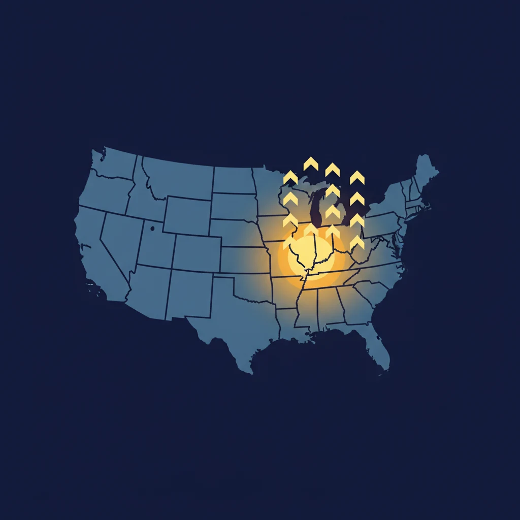
The answer is not the Sun Belt. It's Wisconsin. And Michigan, and upstate New York, and the quiet middle of Pennsylvania and Illinois. The places that score best on all three things at once are the ones almost nobody is making TikToks about.
We ran every U.S. county through three filters: a clean safety grade (A, B+, or B), genuine affordability (a typical home costing only about two to three times the local income, versus five times or more in the hot coastal markets), and a strong Boom Town Index score. About 108 counties clear all three bars — and they pile up in one part of the map.
First, what the score is actually measuring
This matters, because the headline number is easy to misread. The Boom Town Index score is not a population-boom meter, and it's not a "this town is thriving right now" stamp. It's a forecast — specifically, a machine-learning model's best guess at how much a county's home prices will rise over the next five years relative to the national market. A score of 100 means the model puts that county at the very top of the pack for projected home-price appreciation, not that its population is exploding.
That distinction explains the whole map. Most of these heartland counties are flat or slightly shrinking in population. They are not booming in the way the word usually means. What the model sees in them is something quieter: homes that look cheap relative to what people there actually earn.
One honest caveat about the "why." The model is a gradient-boosting algorithm trained on roughly two decades of county data — home-price momentum, incomes, jobs, building permits, local economics. It doesn't hand us a tidy reason for each pick, so we won't pretend to read its mind. But the pattern is consistent with a familiar idea: when housing is unusually affordable relative to local wages, there's more room for prices to drift back toward fair value. Call it the model betting on catch-up rather than on hype.
The receipts
Here are a handful of the counties that clear all three bars — safe, affordable, and near the top of the forecast. The five-year figures are the model's projections, not promises (more on that below).
| County | BTI | Safety | Typical home | 5-yr forecast |
|---|---|---|---|---|
| Newton County, MO | 100 | B | $162,900 | +46.8% |
| Marathon County, WI | 98 | A | $194,500 | +41.9% |
| Oswego County, NY | 97 | A | $131,800 | +41.0% |
| Broome County, NY | 91 | B+ | $139,200 | +36.6% |
| Sheboygan County, WI | 93 | A | $198,900 | +37.3% |
| St. Clair County, MI | 88 | A | $197,300 | +34.9% |
Marathon County, Wisconsin — Wausau and its surroundings — is the cleanest example. A safety grade of A, a homicide rate well below the national average, a typical home under $200,000 against a local median income north of $70,000, and jobs ticking up about 1% a year. It is the opposite of a frontier town, and the model ranks it 98 out of 100.
Broome County, New York, around Binghamton, tells a similar story with a twist: it has the strongest job growth of the group, up roughly 2% in the latest year, with the cheapest homes on the list. Oswego County, on Lake Ontario, pairs an A safety grade with homes near $130,000 — a price that simply does not exist in the markets people usually chase.
About that "safe" part — yes, we know
If you've read us before, this might look like a contradiction. We've written that the very top of the Boom Town Index skews unsafe — that a lot of the highest-scoring counties carry rough crime grades, because economic distress and growth potential often live in the same zip code. That's still true.
The resolution is in the filter. The full top of the index does lean unsafe. But once you carve out only the counties that also earn a strong safety grade, you're left with a distinct, smaller group — and that group has a personality. It's affordable, it's stable, and it's overwhelmingly in the upper Midwest and the older industrial Northeast. You can browse the full picture in our safest-counties ranking and the most-affordable list; this post is what happens when you lay those two on top of the growth forecast.
What this does and doesn't mean for an actual move
A five-year price forecast is a useful lens, but it is not a financial plan, and it is definitely not a reason to move somewhere by itself. These are model projections built on historical patterns; housing markets surprise everyone, and your own decision turns on things no county score can see — where the job is, where family is, whether you can stand a February in Wausau.
The useful takeaway is narrower and more interesting than a hot-list: the boring middle of the country is quietly the best value in America right now, at least by the combination most movers actually say they want. The places that are safe and cheap and have room to appreciate aren't hiding in the Sun Belt. They're a few hours from a Great Lake.
See where your state lands
Every county in the index has a safety grade, an affordability read, and a five-year forecast on its profile.
Browse the safest countiesFAQ
Does a high Boom Town Index score mean the population is booming?
No. The score is a forecast of how much a county's home prices may rise over the next five years relative to the national market. It says nothing on its own about whether the population is growing — and many of the highest-scoring affordable counties are actually flat or shrinking in headcount.
Are these five-year forecasts a guarantee that prices will rise?
No. They're the output of a machine-learning model trained on historical data, and they can be wrong. We publish them as one input, not as investment advice. Treat a forecast the way you'd treat a weather forecast a long way out: directional, not destiny.
Why does the model favor places that aren't growing in population?
Because it's predicting price movement, not headcount. The consistent pattern among its affordable favorites is housing that's cheap relative to local incomes — which historically leaves more room for prices to rise toward fair value. That's an interpretation of the pattern, not a rule we hand-coded.
Where can I see the full lists?
The safest-counties and most-affordable-counties rankings cover every qualifying county, and each county's own page shows its safety grade, affordability, and forecast together.