America's Next Boom Towns Aren't Where You Think: We Ranked 9 Housing-Market Types
Ask anyone where America is booming and you'll hear the same answer: the Sun Belt. Phoenix, Houston, the exploding exurbs of Tennessee and the Carolinas. So here's the surprise hiding in our own model. When we sort every U.S. county into the nine market types our index recognizes and rank those types by what the model predicts for the year ahead, the fast-growing Sun Belt exurbs land near the bottom — and the one on top is the unglamorous industrial Midwest.
That's not a typo. The archetype with the country's highest population growth scores a 23.8. The archetype built from steady Great Lakes counties scores 82.7. Before that flips your relocation plans upside down, it's worth being precise about what the number actually measures — because the whole twist lives in that definition.
What the score is actually predicting
The Boom Town Index score isn't a measure of how much a place is booming right now. It's the model's prediction of a county's home-price growth over the next year relative to the national rate — a residual — expressed as a 0-to-100 percentile. A score of 82 means the model expects that county to outperform the national market. A score of 14 means it expects underperformance.
Two things this is not. First, a high score is not a promise of big absolute gains — if the national market is flat, "outperforming" can still mean modest growth. Second, it's the model's prediction, not a law of economics or a guarantee. The model reads housing and economic data; it can't see a factory announcement or a rate shock coming.
So when we say "boom town," we mean it the way the model does: a county predicted to beat the national average next year — which is a very different thing from where the cranes and U-Hauls are today. That gap between "booming now" and "predicted to outperform next" is the entire story.
The nine types, ranked by the model
Each county gets clustered into one of nine market archetypes based on its housing, income, and growth fingerprint. Here's the average score for each, top to bottom:
| Market type | Avg score | Counties |
|---|---|---|
| Heartland steady growth | 82.7 | 145 |
| Affordable slow markets | 67.7 | 75 |
| Secondary-market surge | 55.6 | 35 |
| Persistent housing weakness | 55.0 | 11 |
| Idiosyncratic markets | 50.5 | 414 |
| Educated suburban growth | 43.6 | 110 |
| Western premium correction | 24.8 | 78 |
| Sun Belt exurban boom | 23.8 | 43 |
| Sun Belt post-surge correction | 13.9 | 76 |
The top: steady beats spectacular
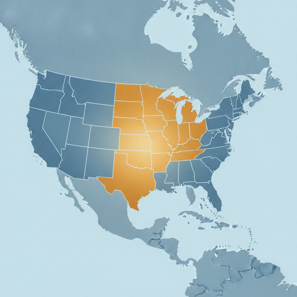
The model's favorite type is heartland steady growth — roughly 88% Midwest and Great Lakes, places like Cuyahoga County (Cleveland), Summit County (Akron), and Will County outside Chicago. Their population growth is a yawn-inducing 1.8% a year. What they have instead is the one number the model keeps rewarding: an income-to-home ratio of 0.389, the most affordable relative to local incomes of any named type. Wages are rising about 3.7%. Nobody's moving there for the mountains — the natural-amenity score is rock-bottom.
Right behind them sit the affordable slow markets at 67.7, where population is actually shrinking slightly but homes remain cheap against incomes. This cluster is full of the quiet county pages that quietly do well on our site — including Pulaski County, Kentucky. The throughline at the top of the list isn't growth. It's headroom: places where prices haven't already outrun what locals earn.
The bottom: where prices already ran ahead
Now the counterintuitive end. The Sun Belt exurban boom type — Greenville SC, Rutherford and Madison counties, Benton County in Arkansas — has the highest population growth in the country at 2.49%, booming permits, and strong job and wage gains. It scores 23.8. Just below it, the Sun Belt post-surge correction type — Houston's Harris County, Phoenix's Maricopa, Dallas, San Antonio — scores the lowest of all at 13.9: these metros surged more than 50% during the pandemic and are now posting outright one-year price declines even as people keep arriving.
The most beautiful places fare no better. The western premium correction type — Los Angeles, San Diego, Orange County, Seattle's King County — has the highest amenity scores in the nation and the worst affordability, an income-to-home ratio of just 0.173. It scores 24.8. Coastline and mountains don't move the model; the price tag relative to local paychecks does.
Why "fastest-growing" and "best bet" pull apart here
It's tempting to read this as "population growth is bad for home prices." That's not what's happening, and it's worth getting right. Population growth isn't even an input the model looks at directly. What the model sees is the housing and economic fingerprint a fast-growing place leaves behind: prices that have already jumped, valuations stretched against incomes, building permits flooding in to add supply. In this cross-section of archetypes, the places that already surged tend to be the ones the model expects to cool relative to the national average next — not because growth is a curse, but because a lot of the future was already paid for at today's prices.
This is the same logic behind valuing a house like a stock with a price-to-earnings ratio, and behind the signals that a hot county has already peaked. "Fastest-growing" lists describe the recent past. The model is trying to describe the next leg — and the two genuinely diverge.
Read the county, not just the cluster. These are averages across dozens of counties. A type scoring 24 still contains individual counties the model likes, and the 82.7 cluster contains laggards. The archetype tells you the pattern; the county page tells you the prediction. And none of this is financial or relocation advice — it's one model's read of public data.
How to actually use this
If you're choosing where to move or buy, the practical move is to stop treating "where everyone's moving" as a buy signal. Compare the fastest-growing counties against where the model actually points, and notice how little they overlap. Then narrow to the archetype that fits your life — and remember that the affordable, unspectacular middle of the country is where the model sees the most room to run. As we've argued before, the safest, most affordable places usually aren't the boom towns at all. The model just quantified why.